


A/B/+ Testing
Role Involved
UX, Implementation, Analytics
Problem
The product team project queue was long and priorities leaned towards new features rather than maintaining existing features. Furthermore, new features pushed to production weren't always fully tested and optimized.
Strategy
To combat this, I secured a budget for A/B testing to run ongoing experiments on pages we developed to compare conversions across varying views of the same pages. The following are just a few experiments I ran that led to significant boosts in conversions.
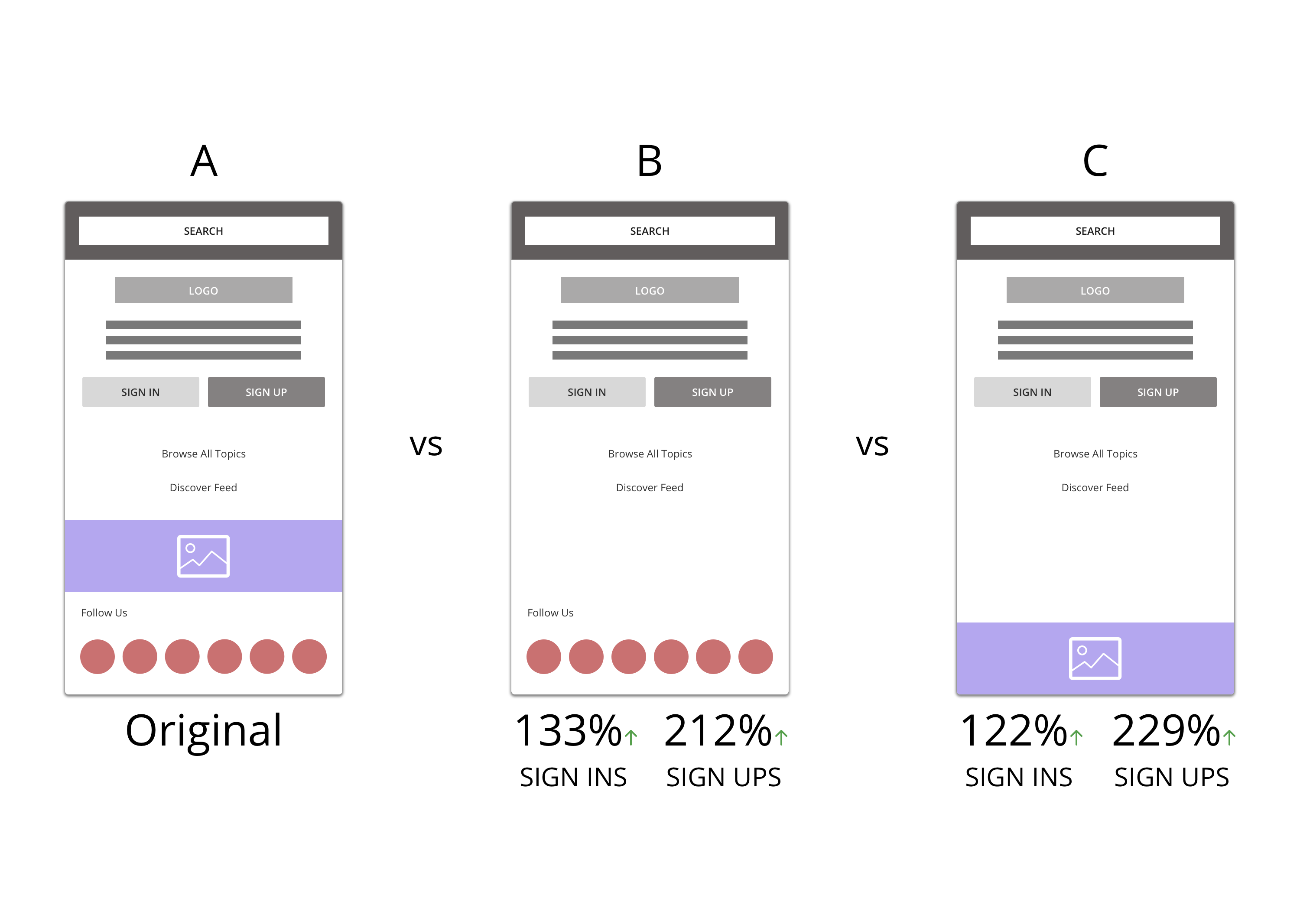
Mobile Menu Experiment
Signing in and signing up are two of our core KPIs. About 70% of our userbase uses our platform via mobile web, so I conducted an experiment on the menu screen that serves as a funnel towards both. Looking at the original page, I saw some common practices that are often pushed through into the design process - making pages visually engaging through imagery and adding additional CTAs for the users to perform more actions.
Feeling that imagery for imagery's sake distracts from the experience, I implemented the first variation without the image included in the menu. Then, I added a second variation without the additional CTA to follow us on social. Although following us is another KPI important to the business, by no means is it of equal value to users signing in or signing up.
Through this experiment, I was able to prove to the team that less is more and making designs with too many CTAs and image comes at a cost. Due to both variations doing immensely better in converting users to both sign in and sign up, we quickly developed edits to the page simplifying it for the better. This finding later helped us improve a lot of our email templates boosting their click rates!
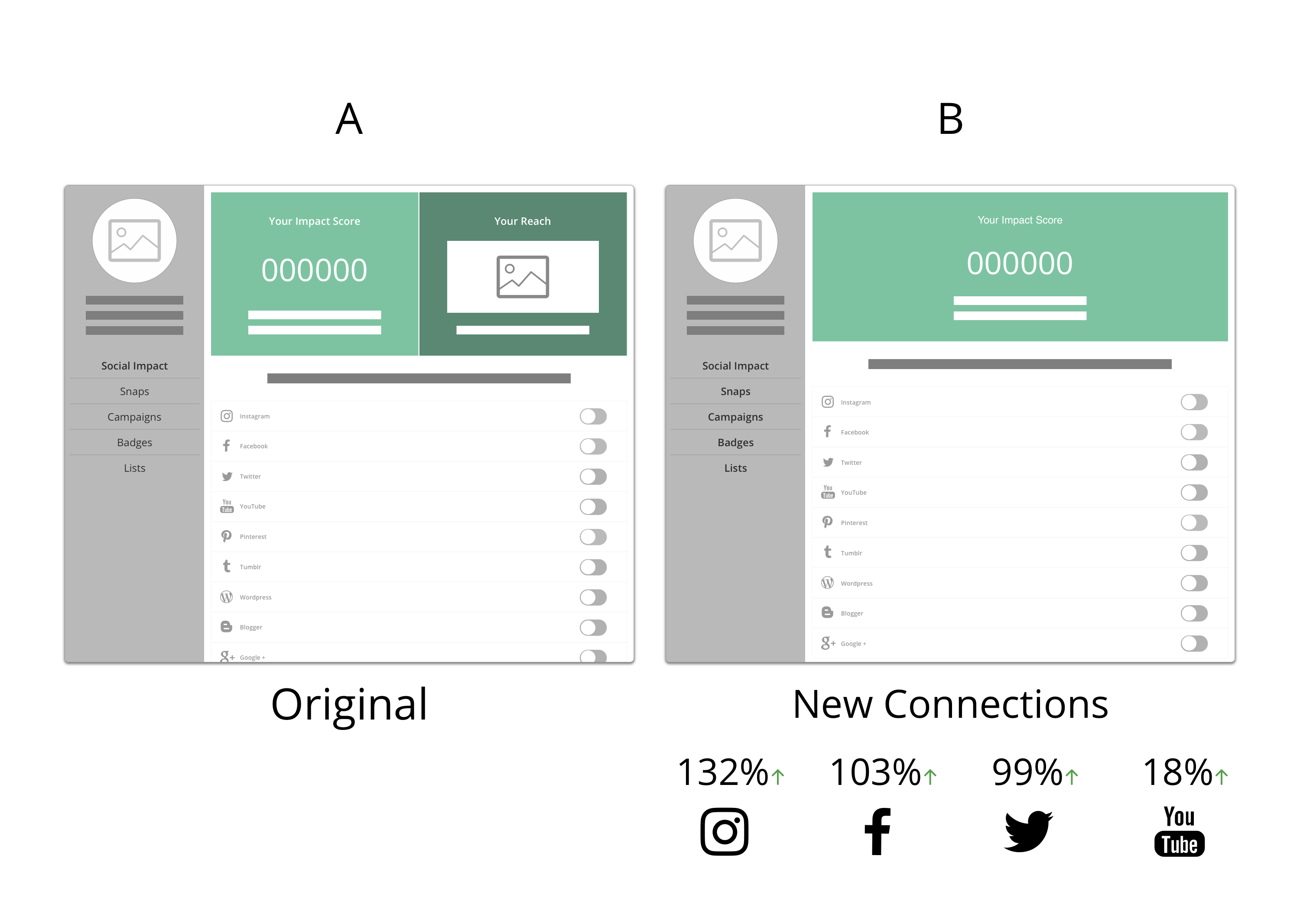
Desktop Connection Experiment
Due to our campaigns being powered by our social-media active user base, it's crucial that members connect their social accounts with us otherwise it's difficult for us to determine our members standings and whether they'd be a good fit for a program. As a way to gamify this, I initially strategized this Influenster "Impact" score that measured a user's literal social following across all connected networks. The higher the score = the higher the chance to be invited towards a campaign.
During the design process, especially without having the resources for proper user testing, we aired on the side of caution adding extra explanation to drive a smoother onboarding of the feature. When it comes to copy and design, I prefer less explanation - that if a feature is not self-explanatory, or needs a large amount of explanation (what I call red tape), chances are it's not the right solution. If a design uses too much hand holding explaining the action, then a simple action can suddenly feel more difficult and confusing. With that in mind, I removed an extra section adding more context to how "good" a user's score was in relation to other users, starting at "not so good" if the user was at 0, to see whether it was really helping.
Through this experiment, I was able to find that the extra explanation and visuals acted as a distraction from the main call to action of connecting. By removing the visuals, the score became the main focus and the explanation to connect below to boost your score became more clear - increasing conversion rates greatly across the main networks our clients ask about. This finding later helped improve several other areas of the site that were somewhat TMI.
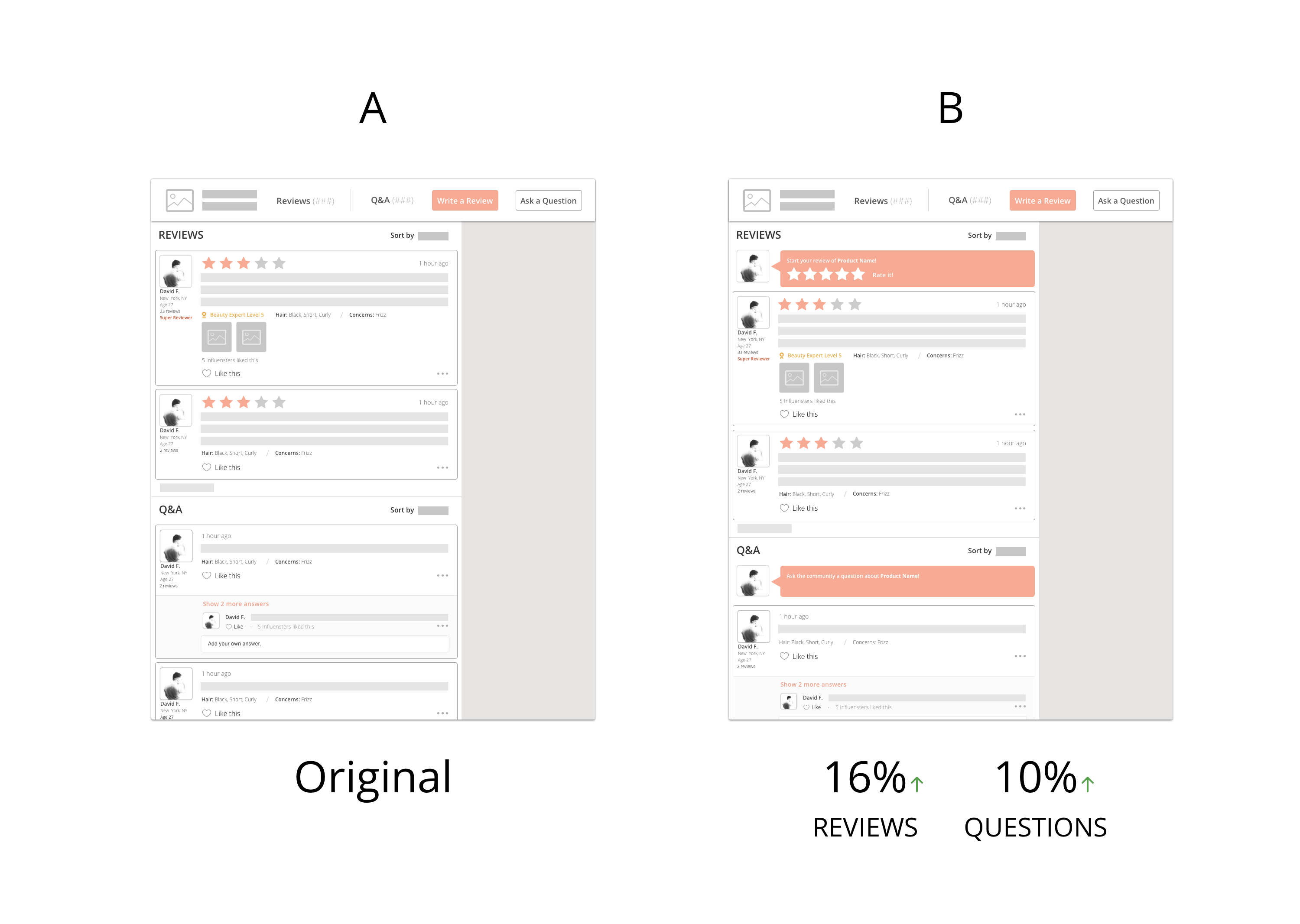
Conversation Modules
In one iteration of our desktop product page, I was looking to boost our organic reviews and questions, a main indicator of user retention. Hoping to invite the user to start writing versus opt-in with the control's button, I ran an A/B test. In the new variation, I added two forms that when tapped, triggered a front-end interaction for the user to type more in newly expanded textboxes. For reviews specifically, I probed users to tap into 5 grayed out stars, asking them to "Rate it!", carrying over their rating into a new lightbox to add their written review to finish their submission.
After testing, the new form interactions resulted in a 16% boost in reviews and 10% boost in questions. From the findings, we carried this style of CTA for UGC into different areas of the app and automated emails to further boost UGC.