


App Overhaul
Role Involved
UX, PM
Problem
We needed to redevelop our app from scratch in Swift to meet the latest Apple standards. In the process, we took this opportunity to tackle some navigation concerns. One concern in particular was that our past home page had many limitations in how much content and what kinds of content we could show. Additionally, the user profile page was segmented into several tabs of content and split between two inconsistent personal and public views.
Strategy
I worked heavily with our UI designer over several weeks to outline different personas, use cases, and goals of the app. We mocked up core pages to get approval of the overall navigation and functionalities. Then, we worked to finalize the UX and UI stylings of more specific features. After approvals, we later adopted the new app direction to our desktop and mobile web platforms.
The following are three variations we considered in organizing the Influenster app:
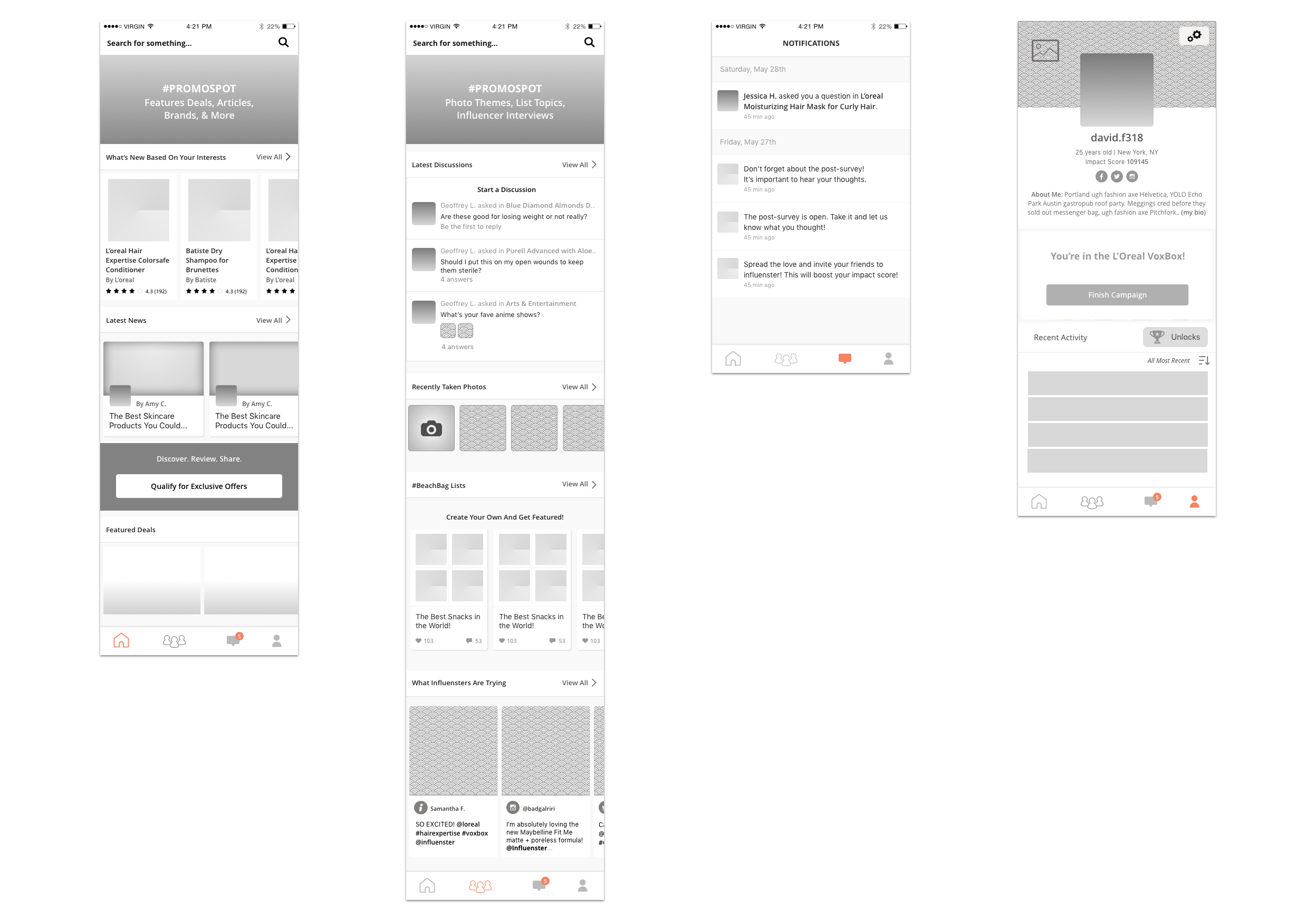
Version A: Community Scaling
The strategy behind Version A was a more aggressive approach to adding social networking features to the platform. At the time, we had very little UGC featured on the platform outside of buried product pages. The emphasis was entirely on searching and browsing by category. With this version, we focused on turning the home page into a curation of news and products, and adding an additional area dedicated to feature UGC and community interactions.
We also added a new section for notifications, which was previously hidden in the profile. Pulling it out into the navigation gave prominence to accessing additional social networking notifications and recommendations, along with any timely CTAs related to our internal promotions.
Lastly, we streamlined the profile to be focused on personalization and past activity. Instead of having a CTA overload between many tabs, we introduced more simplified UI cards that would pop out above recent activity for time sensitive action reminders, such as an internal promotion for a client, or an unfinished survey the user had to take.
We did not go with Version A, although it was a strategy that best scaled up to where we wanted to be. The main reason for this was that we felt unprepared to support this amount of featured content. We weren't confident that the community would post in the frequency and quality that we were designing for.
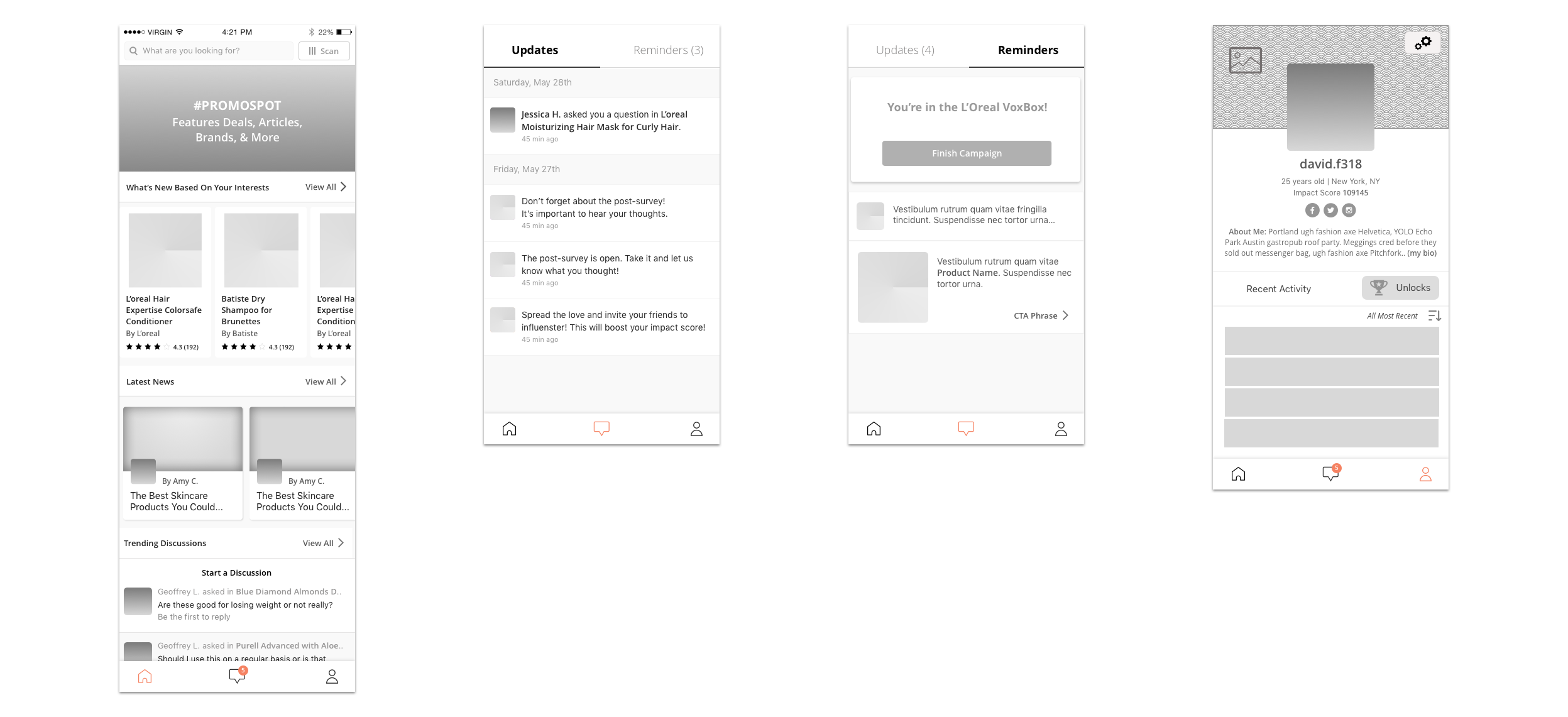
Version B: Minimalist
The strategy behind Version B was a more radical approach of tearing down the labels between different features, and focus more on the core user goals for the different areas in the navigation: Discovery, Action, and Personalization.
In this way, the home page for Version B was devoted to allowing the user to browse curated content from both Influenster and other Influenster users. This was achieved through mixing modules controlled by staff and modules automatically populated based on the user's past activity.
Notifications then served as a mix of updates and reminders. The idea behind this was that there are several automated social networking notifications that don't expire based on user-to-user interactions. However, we also have several time sensitive alerts that should expire if the related action is completed, mainly Influenster-to-user reminders. We typically put these urgent alerts on the profile (as you'll see in Versions A and C), but doing so can risk adding too many elements to a power-user's profile.
Lastly, the user profile would be simplified of its previous CTAs, which were moved to notifications, and focus entirely on personalization and viewing recent activity. This profile was appealing as it would be easier to scale up adding new forms of content creation and social networking features down the line.
After deliberation, we chose not to go with Version B, as it was too radical and took away too many entry points for searching and creating content. The simplicity as an exercise though was refreshing in giving us direction towards our users' goals.
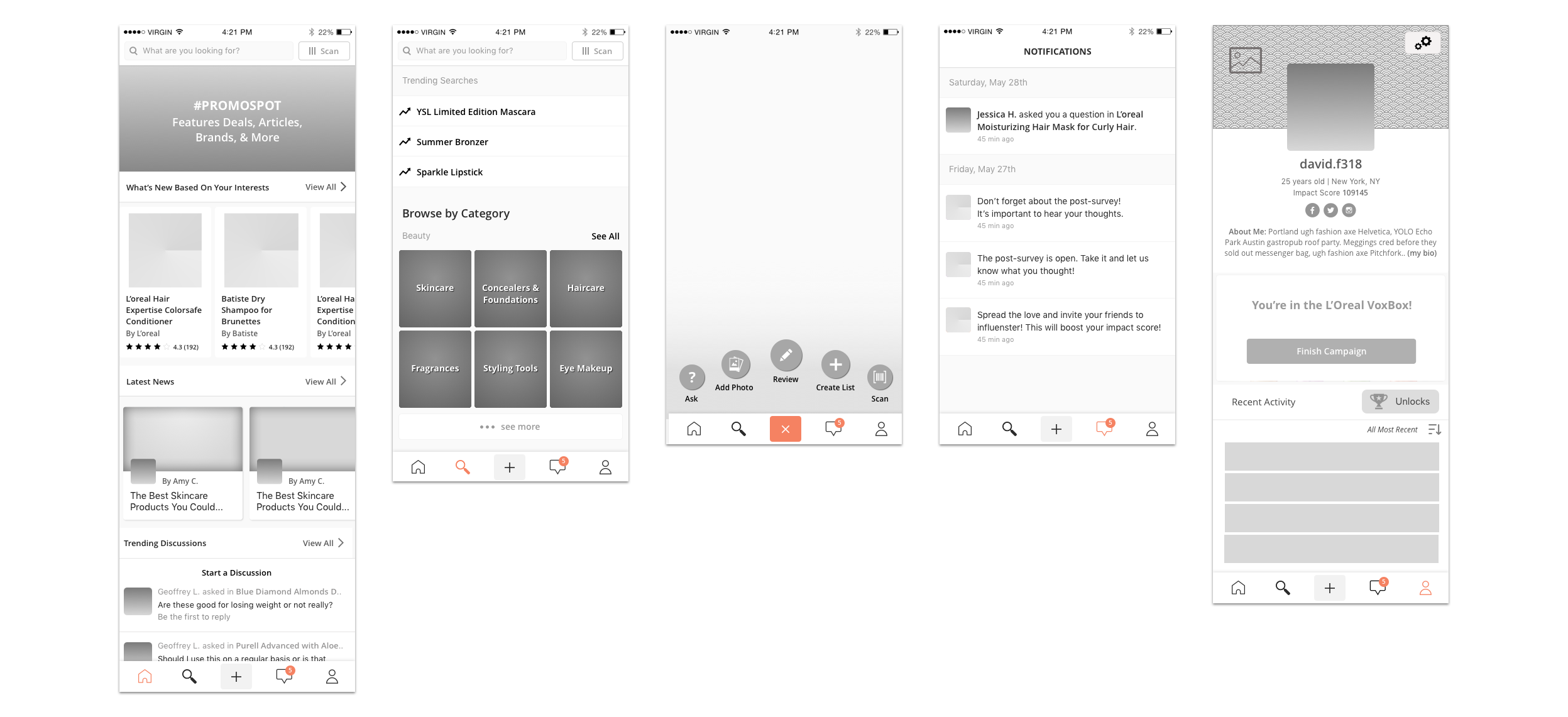
Version C: Search Centric
Version C, the version that was approved and developed, was the more conservative approach. For this strategy, we kept an area devoted entirely to searching and browsing by category, similar to the app's old home page, but still added a new home page to allow for custom modules to adapt based on our own curations or automated recommendations.
One of the major appeals of Version C was that it introduced a minimal approach to content creation that was lacking in the previous version via the center menu button. This button served as a quick shortcut to post content from anywhere on the app, adding a small overlay over whatever page the user was currently viewing.
Lastly, we kept the profile strategy from Version A, streamlining the profile to have less competing CTAs and putting more emphasis on the CTAs that are important and time sensitive, like client promotions.
Results
After the app launched for iOS and Android, we saw a 12.2% growth in user traffic to the app, 15% growth in quarterly active app users, 17.1% growth in screen views, and 72.8% growth in average screens per session. Currently the iOS app holds a 4.5 rating with over 1.9k reviews. The Android app holds a 4.1 rating with over 4k reviews.